In august 2022 we the team got the go ahead to redesign the UI and menus in HackShield. My role as the chief UX designer was to lead this process and deliver an improved design. My first move was to get data and do research about the old menu that was currently in use. The next thing I did was to use my experience of user-friendly design practices to set up design guidelines and rules for the new design.
The goals we established are: 'Improve efficiency (for the most important tasks the user wants to achieve)', ' 'After discussing that with the team and receiving a go-ahead I made a list of existing and new user stories for features we wanted our new menu'’ to support. I created a (black and white) wire-frame and flow in order to establish the core screens, buttons and features that we would be planning.
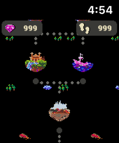
In this process I applied my knowledge and experience as a usability expert to make sure user-friendly design principles are a part of the new designs. Some examples of this is to maximize the efficiency with which a user can accomplish their tasks. I prioritized the list of user-stories based on frequency and importance. To minimize the amount of clicks and/or screens I went for a spider-web design where the main menu acts as a central hub and most other screens are always only 2 screens away.
The next step was for me to translate our recently established style guide for print to a digital visual design style guide. One important aspect of the design is the principle of '’recognition rather than recall'. This principle facilitates accessibility. Some examples of the means through which the design facilitates this is by setting strict guidelines for interactive elements.
Buttons always have to have one pair of three possible color gradients. The font for buttons is consistent. And finally: if there is enough space, buttons should contain both an icon as well as text in order to explain their effect. The result of these endeavors is now fully playable at
https://joinhackshield.nl